We are proud to present our church logo above. It is an elegant design comprising “L” and “3” in the shape of a heart, resembling the 3 Ls in our church name, “Lord’s Light of Love”. The gold color represents God’s Golden City in Heaven where we aspire towards.
We had an exciting logo design competition amongst our members and the above was the winning design (by Pastor Ben Hur himself!) that had the most votes. However, we want to recognize the efforts of our other designers and their logos. So here are the runner-up and second runner up in the competition!

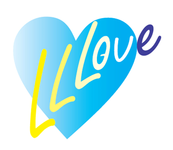
Runner-Up Design by Josephine
Blue Heart represents the Holy Spirit.
Three Yellow Ls represent the “Lord’s Light of Love” and the color of the sun, like God’s light.
O shape that looks like Omega and God’s eyes.
Blue “e” represents our dedication towards evangelism.

2nd Runner-up design by John Heng
The logo contains 3 overlapping “L”s to represent the Lord’s Light of Love Church. It is also shaped in a triple “V” to represent the Lord’s Victory.
The Heart shape captures the essence of our church – love!
The circle containing it all represents our church that embraces everything into one body.
Gold color represents the enduring and priceless quality of being God’s beloved.
